
August 19, 2009
| A Piece of the Planet, Pinned To Your Chest >>
Rockin' Microsoft Fonts
Microsoft has taken an epic amount of abuse for Arial, their now-ubiquitous Helvetica knockoff. But, uh, did anybody notice… I think they took it to heart… ‘cause the new Windows fonts are really good?
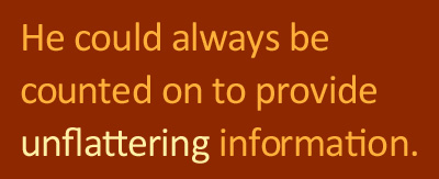
And they’re not even that new, right? I think they’ve been out since 2007. Anyway, one in particular, Calibri, is just really nice. Of course, I think it’s nice, in part, because it has many ligatures (see above).
Maybe this is old news and everyone has been joyfully typing away in Calibri and Consolas for years now. I’m just getting wise. And looking for synonyms with the “ti” word pairing.
Update: Actually, I totally remember when this Poynter piece by Anne Van Wags about the C-family came out. But it was all “ooh, wow, coming soon, maybe” and then somehow I missed the actual release of these fonts.


Comments
Yeah, Calibri is the default font in Office now - so I use and like it. I also think Trebuchet MS is a pretty font - a nice default, anyways, for a web page.
Font-heads might appreciate that I printed my dissertation in Myriad Pro. Actually, that's not totally true. One page is in part Myriad Pro, part Helvetica. The Helvetica text reads "This page is blank." :-)
Haha, how about a ligasaurus mashup? You tell it what font you're using, enter a word, and it gives you synonyms in order of number of ligatures.
Consolas is my new programming font. It looks great in textmate.